
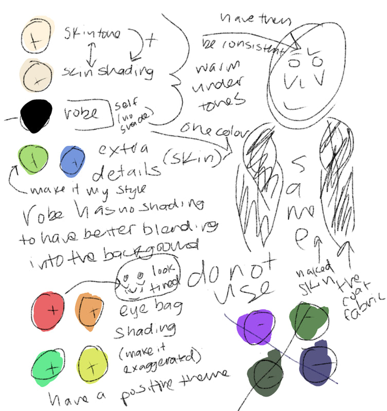
Illustration- Positive
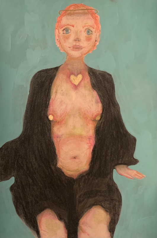
Title: Allure
Size: 38 cm by 25.5 cm
Medium: Mixed Media (colored pencil and acrylic)
Completion: November
Size: 38 cm by 25.5 cm
Medium: Mixed Media (colored pencil and acrylic)
Completion: November
Exhibition Text: Unlike what the media tends to present, there is not one perfect body. This piece shows the beauty in being openly female and showing of what makes you human. This piece was inspired by Pamela Colman Smith (a tarot card designer). In essence, this piece aims to enlighten the viewers ideas of what media teaches the "perfect body" really is.
|
Inspiration:
Originally when I was looking for an inspiration to begin my piece I had trouble finding someone who was both focusing on body positivity, but also the art style I wanted to focus on. Eventually I found Pamela Smith. She is an original designer of tarot cards and this fit perfectly into the type of artwork I was aiming to create. Pamela focused on single color background with precise placement for details. She depicted gods and goddess and this was exactly what I was going to depict as well. Whatever the medium, her artwork vividly embodied her creative, political and spiritual vision. Described as an “odd-artist mystic girl”, the fluidity and convergence of Smith’s many talents and interests became the driving force behind her work. Pamela wanted to create artwork that expressed emotion and story and gave reason to each and every feeling in the cards. She used bright colors and gestures in order to bring the people in the card to life. Each card (or even each artwork) was one of a kind. Not two cards were the same person doing the same thing, in the same setting. This allowed for even more creative freedom when she would create new cards. I wanted to incorporate this work into my art, so I focused on drawing a woman the was entirely one of a kind, exactly how humans are in real life. This also helped me express my creative freedom when designed what drawing I wanted to create. Lastly, Pamela based her drawings off of inspiration she learned about from books and other texts. She focused on mythology and the elements to help her compose a deck to predict emotions and outcomes of events. These inspiration made her deck unique to what people had seen before. She wanted to create a set of conversation starters that would help people learn about themselves in a way that they had not before. She did this even more so through creating a story ling that matches that card a person could draw. She focused entirely on immersing the viewer into the artwork. 
|


|
Planning:
In order to properly begin this piece, I read through most of Pamela's tarot deck and choose specific cards that I believed would truly capture the beauty of the goddess I wanted to create. I needed to find a card that showed use of color to create tone, while also being beautiful for the viewer to look at and enjoy. I came across the card "The Star". This card showed a woman pouring water out as a start shines brightly above in a beautiful blue sky. These elements truly did come together perfectly to show an elegant card full of story and emotion, exactly what I was looking for. Looking through these cards I was able to work on choosing a theme for my work. My theme changed and eventually became "grace". This was important for my work because it was to display the positivity of media and games (if you would consider tarot cards a form of game play). I worked on listing ways in which I could display grace in my artwork. Eventually I came up with a list of things that give me the theme of grace;
In order to properly begin this piece, I read through most of Pamela's tarot deck and choose specific cards that I believed would truly capture the beauty of the goddess I wanted to create. I needed to find a card that showed use of color to create tone, while also being beautiful for the viewer to look at and enjoy. I came across the card "The Star". This card showed a woman pouring water out as a start shines brightly above in a beautiful blue sky. These elements truly did come together perfectly to show an elegant card full of story and emotion, exactly what I was looking for. Looking through these cards I was able to work on choosing a theme for my work. My theme changed and eventually became "grace". This was important for my work because it was to display the positivity of media and games (if you would consider tarot cards a form of game play). I worked on listing ways in which I could display grace in my artwork. Eventually I came up with a list of things that give me the theme of grace;

1. Relaxed posture
2. Calm face 3. Elegant robes 4. Soft features 5. Welcoming face 6. Natural beauty |

|
These six things helped me to shape my artwork into a piece that would truly show grace and beauty as the main themes of the work. In order to properly plan this piece I began by laying out what I wanted to accomplish each day that I would work on the piece. I began with picking out a color pallet that would properly fit into the theme of grace. This would allow me to keep my creativity balanced with effectiveness. Then, I worked on what my main focal point would be. I planned on following in my inspirations footsteps, and drawing a women in her most vulnerable form, to show the true beauty and grace of the human body. This would allow me to use all of the six elements listed above to truly show the theme of grace in my artwork. Lastly, I planned out my foreground and background balance. I wanted the woman to be the certain point and main subject of the drawing. In order to make sure that this would stay true. I planned on following my inspiration, and having a solid colored background. I choose to use a baby green-blue background to match the theme of the tarot cards, as well as depict that the woman is truly a goddess in the sky.

|

|
*This was digitally sketched to allow for better color control.
|
Process/Techniques/Inspiration:


|

As I began putting the final piece together I had had to focus on using my skills as both an artist, but also focusing my creativity. I wanted my piece to cohesively work well together, while also giving off beauty and grace. I began by sketching out the body of the woman so that it would take up a majority of the composition of the paper. This would guide the viewers eyes to the details of her stomach, rather than the blue background behind the woman. Next, I began coloring in the skin tone of the body. I knew I had to be focused on every part of her body so that she would look like a human body (not a full on cartoon).I wanted the piece to be semi-realistic, it should look like a person, without actually being extremely realistic.
|

|
I did this by being loose with my pencil and enlarging the eyes and the bags of the face to create an almost more "cartoony" look to the drawing. This would help me bring the viewers eyes to the woman's body, rather than just her face or surroundings. I needed to bring focus to every small imperfection she had.
Continuing, in order to create the best quality piece that I could, I focused on my colored pencil technique a lot. For example, for the hair and the eyes I wanted a very sharp end to the pencil so that I could get very defined lines that stood out against the rest of the piece. Contrastingly, for the skin and the eye bags I wanted a blunt pencil that blended very easily so that I could create a smoother texture for the rest of the piece. Similar to my inspiration, my piece included both realistic elements, but also elements of imagination and the known. Tarot cards focus on the mystical aspect of life, and so I wanted to do the same thing for my piece. I did this by adding a halo around the head of the woman, painting a golden heart to show perfection, and painting her nipples gold so that it could show the beauties of woman hood. Finally, the hardest part of putting the project together was definitely deciding on the background. I finished with a blue background and kept it a solid color to create a more positive background (rather than the negative looking grey mess originally).
Continuing, in order to create the best quality piece that I could, I focused on my colored pencil technique a lot. For example, for the hair and the eyes I wanted a very sharp end to the pencil so that I could get very defined lines that stood out against the rest of the piece. Contrastingly, for the skin and the eye bags I wanted a blunt pencil that blended very easily so that I could create a smoother texture for the rest of the piece. Similar to my inspiration, my piece included both realistic elements, but also elements of imagination and the known. Tarot cards focus on the mystical aspect of life, and so I wanted to do the same thing for my piece. I did this by adding a halo around the head of the woman, painting a golden heart to show perfection, and painting her nipples gold so that it could show the beauties of woman hood. Finally, the hardest part of putting the project together was definitely deciding on the background. I finished with a blue background and kept it a solid color to create a more positive background (rather than the negative looking grey mess originally).
Experimentation:
In my past experimentations with art, colored pencils do not usually work well with the visions I create for them. This creates a struggle for me when I have to create a piece with colored pencils. I took this into account when I started my piece. I first began my piece by focusing on just the final composition of the woman's pose and movements. I wanted the woman to almost be alluring to the viewer. I knew that I wanted her to look elegant, but not royal. So I experimented with different shades of peach for her skin, as well as adding other unusual tones such as green and blue. Doing these things helped me better understand how to put together the final composition for the piece. During the process I learned three very important things:
1. Elegance can be created, but in the end it is all up to how the viewer decides to interpret the piece.
2. Creating clothing out of color pencils is easier done when you do not have to make it hyper realistic, stick to the basics for this one.
3. Exploring the tone of the piece as you work through it can help you better understand the piece as you make it.
Continuing, as I worked on the project I also experimented with the composition of the clothing hanging off of the woman. The clothing was supposed to represent the grace the woman had as she drapes it across her body, showing only want she wants to, thus creating a beautiful image. This was something I struggled with originally because I could not get the composition quite right. Eventually I was able to have enough skin showing showing that it seemed selective, while also being graceful. I was able to manifest my way to a picture that truly represented my theme of confusion. Finally, with these revelations, I was a was able to decide on a background, hairstyle, and clothing composition that made sense. Using my new skills surrounding technical art, I had a better understanding of color creating mood, and technique with colored pencils. This in the end created a piece that both matched my inspiration, while also being original.

|

|
These two photos show the contrasting ideas I worked through in order to get to my final piece. Originally, I wanted to have newspaper showing words of love for her body, but I realized it look more like I was covering her skin and features, than it looked positive. This lead me to realize that I should draw a face to match the body.

|

|

|
These two photos show how the viewer could interpret the drawing based on the material that is shown in the drawing. When the woman has a draping coat she seems more elegant and put together, but when it is just her sitting, she seems rough and messy. This is because of the use of space and color to create tone in the piece.
Critique:
|
|

|
|
Similarities:
1. Color Both pieces use a very prominent hue of bright and warm colors in order to create a more cohesive theme. In my piece "Allure" the bright blue in the background centers the viewers eyes on the woman in the center, creating an even more obvious center point. In "The Star" the colors focus on the only yellow and thus create a center point. 2. Space In my piece, the space is focused entirely on the body of the woman but even so, the space is used in a way that guides the viewers eyes around the piece. "The Star" does the same with the space in the piece so that they viewers eyes are guided around the background and back to the center. The space of the two pieces both fill the entire canvas to create a more completed look. 3. Subject In both artwork the subject of the piece is a nude women gracefully doing something. In my piece the women is sitting and thus is very similar to the inspiration because she looks very similar. The inspiration piece focuses on a woman's beauty to show grace, similar to my piece as well. 4. Unity Lastly, both pieces create a sense of unity in their work through the color and the subject. This unity creates a more cohesive looking piece. For example, in my work the background is a warm shade of blue that ties in the warm tones of the body. In the inspiration piece, the yellow of the body brings unity from the background and the foreground as a middle color between the two. |
Differences:
1. Scale In my piece, the scale is larger and more focused on the details of the body. I wanted to have the subject be more focused on each "imperfection" so that the viewer could see the entire body. Whereas the inspiration pieces scale is smaller and focuses on more of the entire environment around the woman. 2. Balance The balance of the pieces, although somewhat similar, showcase different amounts of background space fulfillment. The background of "The Star" is more balance than the background of my piece. This creates two different kinds of balance, one completely equal in subject, and one focusing on balancing out the very detailed subject. This creates two separate ideas of balance. 3. Texture Continuing, the texture in "The Star" focuses more on the background. The leaves and the water create texture for the piece, rather than the details on the woman's body. In my piece, the woman's body is detailed and shows stretchmarks and discoloration, this creates texture rather than the solid colored background behind the woman. 4. Emphasis Finally, the emphasis in the piece is focused on two separate things. In the inspiration piece the artist wanted the emphasis to be on the actions of the woman and the star behind her. She focused on having the colors match with these intentions. Whereas in "allure" the emphasis is on the golden heart, halo, and circles on her breasts, showing different emphasis points. |
Reflection:
Looking back on the final piece that I created, I am very proud of the process and product I was able to produce. I was able to adapt quickly to using a skill set I was not used to using, which helped me learn about what my strengths and weaknesses were. Continuing, I was able to see a clear connection between my inspiration and my final piece. I included similar mediums, as well as similar ideas in creating my piece. I knew in the beginning of this piece I had to focus on getting to a final product and not correction every single mistake that I would make. Although I am not a perfectionist, when I work on art I tend to over analyze the piece I am creating and never finish my projects. Knowing this was something I would have to work around I planned out each day and how much work I would get done on that day. This helped me to finish my painting in a timely manner and create a piece I was truly proud of.
Continuing, my favorite part of creating this piece was definitely creating the woman's stretch marks and other details. I had never created a woman completely out of colored pencils before and so I had a lot of fun playing around with it. I enjoyed the amount of creative freedom it gave me when I worked on putting all the different ideas in my head together. Another favorite part of the process I had was working on the black cloth. Originally I did not know what to put over the woman, but it just figured itself out as I went on. Continuing, when I draw in the style of; semi-realism, I tend to include big eye bags a lot. It is a part of my style that I enjoy creating and having. This was something that stayed consistent through this piece and my negative piece "Consuming". My least favorite part of the process was creating the hair. Even now, I am still unsure of the proper way to draw hair with colored pencils. It was something that I really struggled to make look good, and to complete in a way that I would be proud of. This was also true in my negative piece.
In conclusion, I hope that other view my work as a chance to look back on their own life. My work is supposed to enlighten the viewers so that they have to think of a deeper meaning, not just what someone could see at first glance. My piece is to be seen as body-positive and uplifting to people who do not feel they fit into the media's standard of pretty. I want people to be able to be immersed into the art work and be able to enjoy looking at it. I want the craftsmanship of my artwork able to be seen. This way I can understand how to further my own work, and how to make my next piece even better.
ACT Questions:
Clearly explain how you are able to identify the cause effect relationship between your inspiration and its effect on your artwork?
- While completing my artwork I was able to clearly identify the cause and effect relationship between my inspiration and its effect on my artwork through the discussion of focus point and media. My inspiration directly influenced the pose of the women and how much of her body was going to be shown to the viewer. This showed an obvious cause and effect relationship.
What is the overall approach the author has regarding the topic of your inspiration?
- The overall approach my author had regarding my topic of inspiration is that she is always open to wonder and she wants to include grace and mystical ideas into all of her work. She focused on creating people that look elegant, and this is just what I wanted my inspiration to be.
What kind of generalizations and conclusions have you discovered about people, ideas, culture, etc. while you researched your inspiration?
- While working on my art piece I have had to make generalizations about the message that my inspiration artist wanted to have come across with her work. I worked hard on researching the main ideas surrounding the tarot cards, but in the end a lot of it was up to my own interpretation. I also made generalizations about the intentions that would come across in my work.
What is the central idea or theme around your inspirational research?
- The central idea/theme of my inspirational research is grace. I wanted my piece to be as graceful and elegant as possible so that the piece would give off the theme of positive along with grace. This would present itself as a body positive piece, not just some random woman.
What kind of inferences did you make while reading your research?
- While I was reading my research I made inferences about time periods and other sorts of understandings that were not explicitly stated when reading. I wanted to make sure that my inspiration matched my research, so I inferred which cites and articles would be best to get that information from. I also inferred how the information would best connect with my final product of a drawing.
Bibliography:
The Media And Body Image - Mirror. (2020, June 11). Retrieved November 26, 2020, from https://mirror-mirror.org/body-image/the-media-and-body-image
Potts, D. (2018, July 26). Who was Pamela Colman Smith? The 'mystic' woman behind the Rider-Waite tarot deck. Retrieved November 26, 2020, from https://www.thelily.com/who-was-pamela-colman-smith-the-mystic-woman-behind-the-rider-waite-tarot-deck/
Tea, M. (2018, September 02). The Divine Mystery of Pamela Colman Smith. Retrieved November 26, 2020, from https://enchantedlivingmagazine.com/divine-mystery-pamela-colman-smith/
Wigington, P. (2019). Pamela Colman Smith: The Artist Behind the Tarot. Retrieved November 26, 2020, from https://www.thoughtco.com/pamela-colman-smith-4687636
